Hey, Sparkles, have you had your OWN family photos taken lately? Headshots, possibly? If not, I hope you get out the calendar, call your go-to photog and get it on the schedule right freaking now. Why, you ask? It’s so important to put yourself in your clients’ shoes. Your clients are feverishly looking for family portrait clothing ideas (probably even before they’ve scheduled a session with you). Will this look right? Will that? What about these colors? Too plain? Too bold? Too many patterns? Gah! The struggle goes on and on when it comes to family portrait clothing ideas and all the related fussing.
Family portrait clothing ideas don’t have to be a big issue (promise!)
You can start helping clients diffuse this issue (and, if you’re reading as a client looking for family portrait clothing ideas – keep reading – I have a shot of glitter in this post for you, too!)
As a photographer, if you have your own session once a year, you can easily remember what your clients go through to prep and then, when it’s their turn, empathize and help them reduce the worry and have a relaxing dream photo session with you, their AMAZING photographer.
When you help your clients sift through family portrait clothing ideas *using color theory, of course* you are creating an amazing bond right out of the glitter gate. You are serving clients in a professional capacity; helping predict problems; improving client/photographer relationships and adding value to your session! All of this photo session gold upps the chance that the client will come back and see you again in the future. Hello, loyalty treasure box.
So, let’s toss this gold around and see what happens, shall we?
Using color theory for family portrait clothing ideas is an AMAZING way to beautify your session (and calm your clients).
I have a masters degree in art education and, after teaching art for 10 years, color theory is one of my FAVORITE things to teach. I could give you the textbook version of color theory. Or, I could give you the blog-version (which will help you plan just as well) and we can move on with our day. So, as much as I want to get to the nitty-gritty level, here’s a nice overview to get you on the right path.

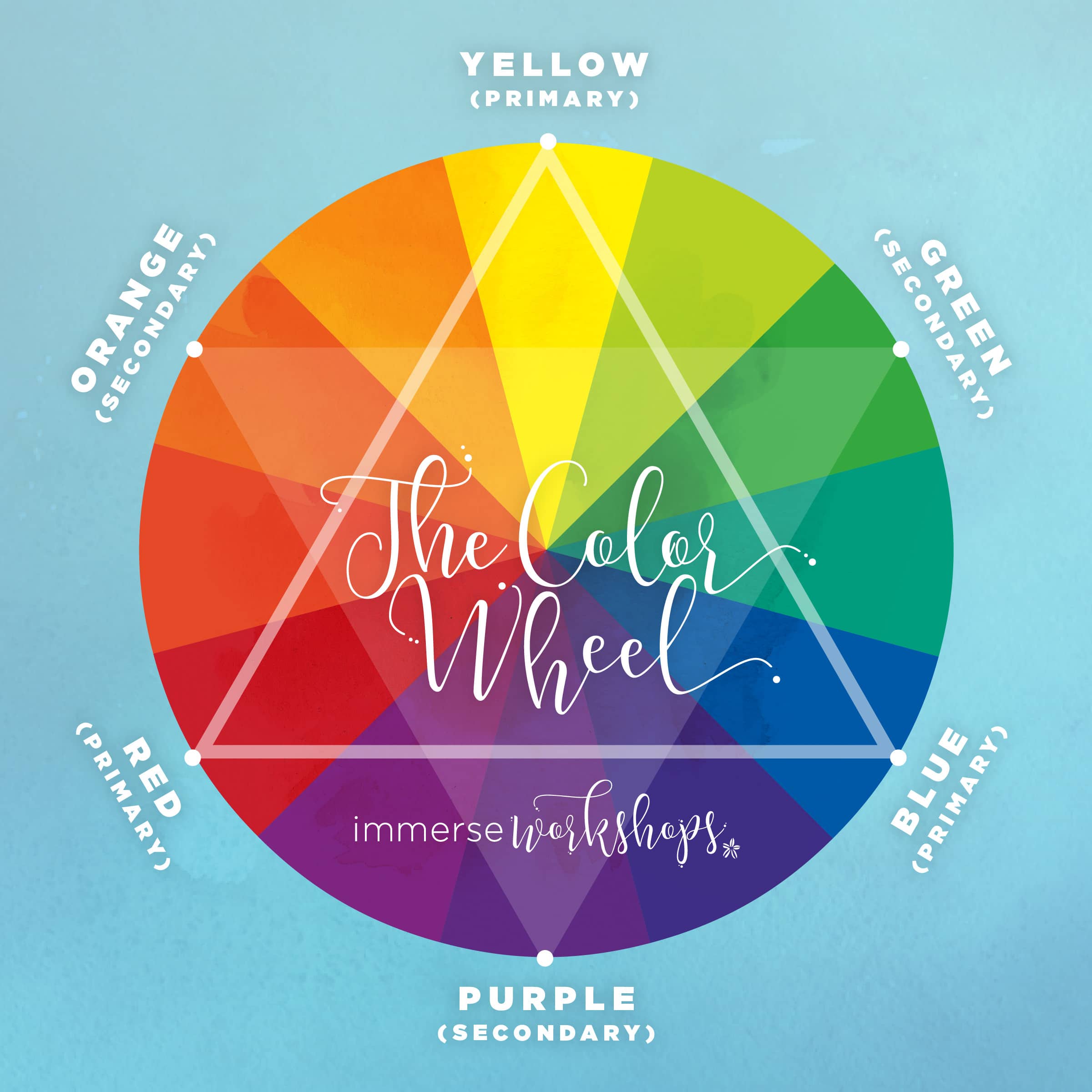
The color wheel (your bff) contains primary, secondary, and tertiary colors. Primary colors are the mommy/daddy colors on this wheel. They are the base that all other colors are made from. When the primaries get a little saucy and mix together, you get precious little secondary colors. And thennnnn, things get a litttttle wild with the tertiaries. A tertiary color is a mix of a primary and it’s closest secondary color (look: red+orange = red orange). When they mix, it’s all unicorns and glitter the fun just doesn’t stop.
Now that you’re comfy with how primary and secondary colors work, you can start to understand how they relate; then, you can make informed decisions about family portrait clothing ideas (aka look like a superstar in your pix!)
Creating beautiful harmonies with family portrait clothing ideas…
When you consider your family portrait clothing ideas, think about what kind of feeling you want for the overall scene. Let’s say your family photos are being taken outside, in the fall, against a gorgeous backdrop of autumn leaves and some hay at sunset. If you want to blend in, pick warm colors like pink, red, coral, orange, yellow). If you want to pop – go in the opposite direction (green, violet, blue, etc). Here’s a little snippet to get you thinking:
-
Warm Colors – colors that make us feel cozy! Think – pink, red, coral, orange, yellow.
-
Cool Colors – colors that are opposite of warm (duh) and make us feel like we need to grab a scarf and a sweater. Green, blue, purple, violet.
-
Monochromatic – very calm and soothing (varying shades of one color).
-
Analogous colors – colors that promote happiness, and energy. These colors that are side-by-side on the color wheel (aka color buddies).
-
Complementary – complementary colors give off lots of energy, but can be distracting if you aren’t careful. They are opposite and across from each other on the color wheel with a lot of contrast. Equal intensity but opposite. Watch yo self here, sparkles.
Once you’ve chosen your two main colors, you can also pick an accent color. This may be seen in jewelry, belts, stripes in a tie, hair bows, and so on. Just remember not to go too crazy {mind your color families; their relationship; and harmonies} and NOT to wear solid black or white – such a bummer when one of those slip in.
Now, I know that communicating all of this to your clients can be a little overwhelming, so my sweet friend Michelle {from I am Michelle Gifford.com} is going to help you out! In her recent blog post, she shares how you can chat with your clients and ensure everyone is on the same page!
 Using Color to Plan Family Portrait Clothing Ideas… a win-win for everyone!
Using colors to select the wardrobe for your family photo shoot is a way to get everyone involved and let the family have ownership over their session. This can be a fun and creative process. If you’re a photographer, being able to walk your client through those decisions helps your client calm down and relax about the process. It also instills trust in you, while you are an authority over the process.
Looking to hire a photographer? If you’re here in Southwest Ohio, contact me over at Immerse Photography. But if you’re not here in the great Buckeye state, be sure to pick a tog who walks through this process with you! Ask friends and family for trusted photographers they’ve used in the past an be sure to check out their work before sending in your deposit. Or, if you’re feeling really crazy, you may want to consult with Tiffany from Grown Up Dress Up, to see what she has to say about family wardrobes {or even hire her to help you out}!
If you’re a a photographer looking for more education and encouragement, I’d love to have you join Sparkle Society. This is a free space on the interwebs, designed to empower and encourage photographers just like your #hawt self. Click here to join us where you’ll be loved and valued as a member forevermore… plus I’ll send you a free mini-workshop of your choosing! So that’s kinda fun too! Will you join us?!
PS – if you love this or think your clients would love this, scroll down and use the pink “pin it” button and my custom pinterest graphic will pop up for ya! #winning

Thanks for sharing your awesome knowledge on color theory. Now I feel like I have a better way to describe clothing choices and the “why” behind it!
you’re so welcome!!! the art teacher in me looooves talking about this!!!
Great post & periscope Cyrissa! You explained it all very well…makes me want to go to your art class & make something pretty! 🙂 Will the color wheel that you used in your periscope be available anywhere by chance?
Nevermind! I reloaded my page and there it is! 🙂
WOOT WOOT!!!! glad you were so excited about it! 🙂